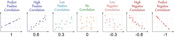
Correlation in graphs
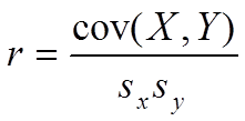
Correlation in formulas
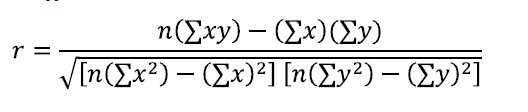
Example: Icecream sales and temperature correlation
Student’s t test (signal/noise ratio) with N-2 degrees of freedom

What is correlation in simple words?
Another example to explain correlation is not causation.


It is very important to draw data in graphs because correlation and other data could be the same (mean, variance, linear relationship), but the data could be very different as in the Anscombe’s quartet.
Linear model
> lm(formula=NO2~NO,data=martorell)
Call:
lm(formula = NO2 ~ NO, data = martorell)
Coefficients:
(Intercept) NO
29.1185 0.3177
lmfit<-lm(formula=NO2~NO,data=martorell)
> plot(lmfit)Hit <Return> to see next plot:
plot(martorell$NO, martorell$NO2)
> abline(lmfit)


This means that the linear relation is NO2=29.1185+0.3177NO
If you ask for summary(lmfit) you will obtain all this information:
> summary(lmfit)
Call:
lm(formula = NO2 ~ NO, data = martorell)
Residuals:
Min 1Q Median 3Q Max
-49.453 -12.389 -1.978 9.845 84.116
Coefficients:
Estimate Std. Error t value Pr(>|t|)
(Intercept) 29.118529 0.216955 134.21 <2e-16 ***
NO 0.317714 0.004818 65.94 <2e-16 ***
—
Signif. codes: 0 ‘***’ 0.001 ‘**’ 0.01 ‘*’ 0.05 ‘.’ 0.1 ‘ ’ 1
Residual standard error: 16.17 on 8242 degrees of freedom
(540 observations deleted due to missingness)
Multiple R-squared: 0.3454, Adjusted R-squared: 0.3453
F-statistic: 4348 on 1 and 8242 DF, p-value: < 2.2e-16
Correlation tests in R
R CODE
> cor.test(martorell$NO,martorell$NO2)
Pearson’s product-moment correlation
data: martorell$NO and martorell$NO2
t = 65.942, df = 8242, p-value < 2.2e-16
alternative hypothesis: true correlation is not equal to 0
95 percent confidence interval:
0.5733714 0.6016387
sample estimates:
cor
0.5876844
This means correlation is 0.59
Corrplot R library allows you to graph different correlation coefficients between pollutants

